Research deck
Wireframe
Prototyping
Brand guidelines and UI for 2 industries
Review widget concept for WIX sites
2021
CONCEPT
Overview
My task was to design a reviews widget for users of WIX site builder — an in-build application for WIX platform.
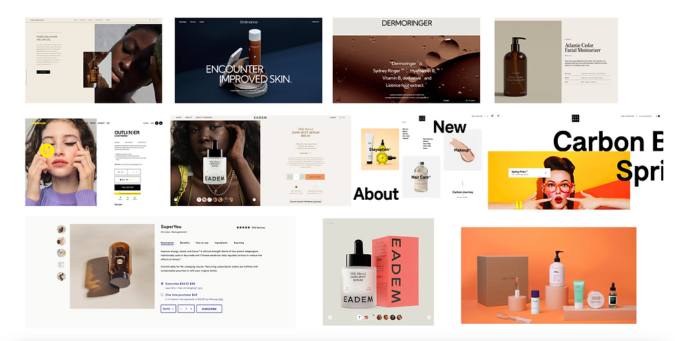
I created wireframes and made a prototype to test a review submission process. Then I made Reviews Feed and Review Submission Form UI design for 2 different industries — online beauty shop and electronics store.
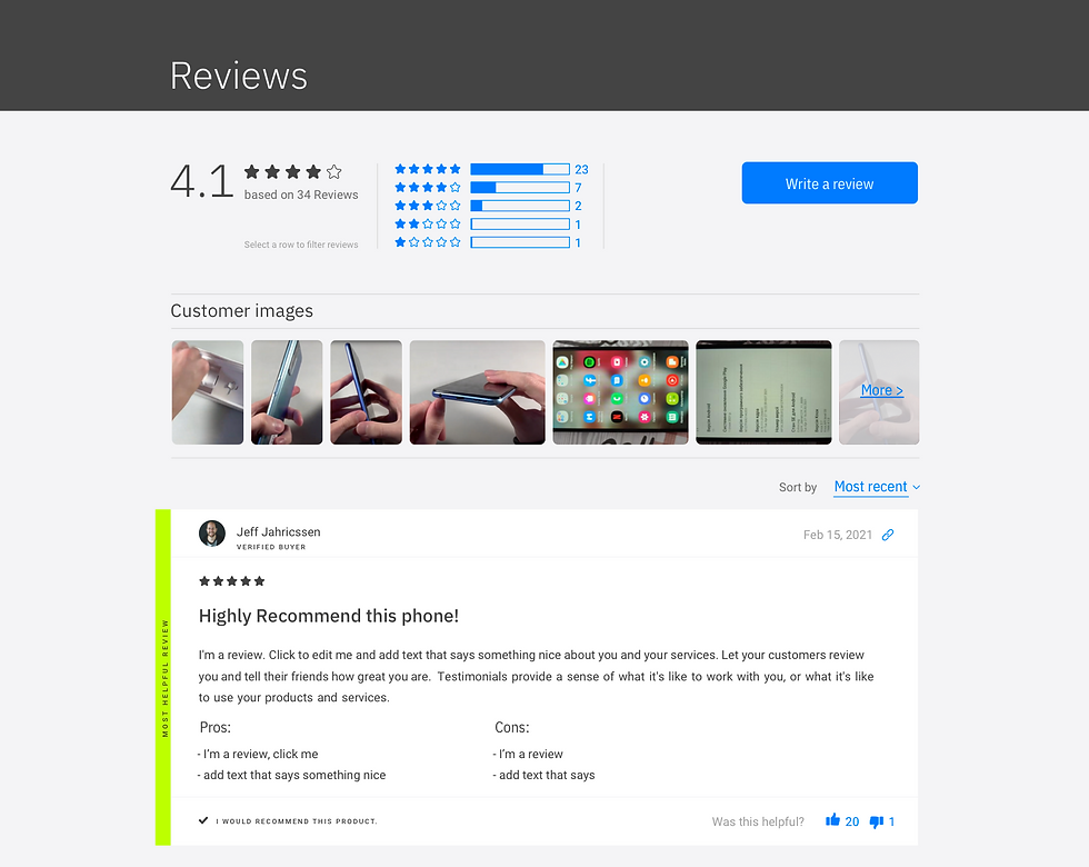
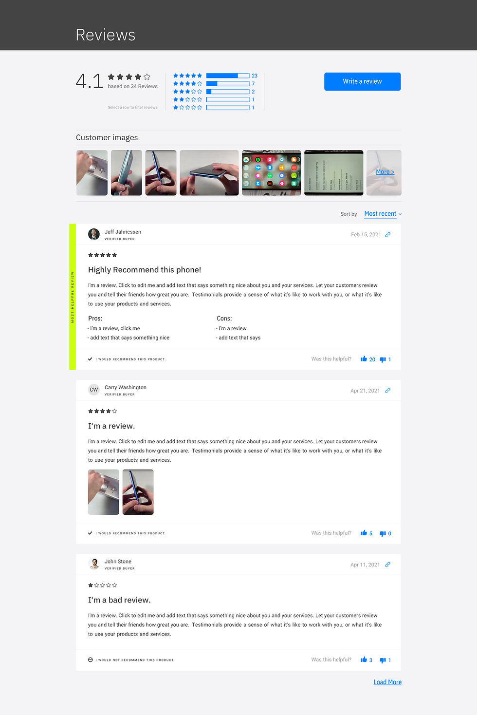
Industry 1 — Electronics Store
After visual research, I collected inspirations based on the brand characteristics: techy, professional, and up-to-date.
Brands guidelines
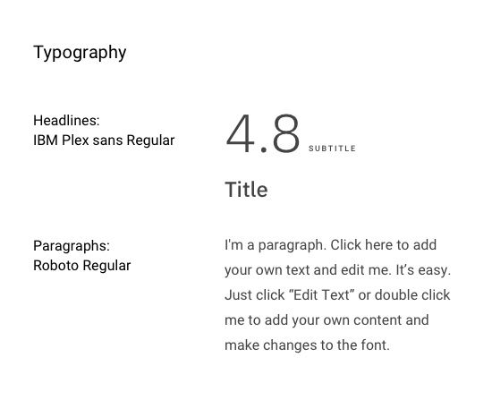
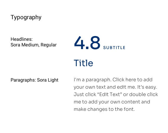
Keeping in mind brand keywords and inspired by visual research I defined font styles and color scheme.

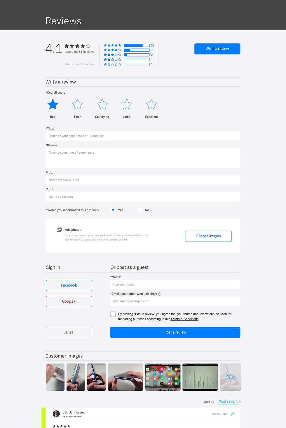
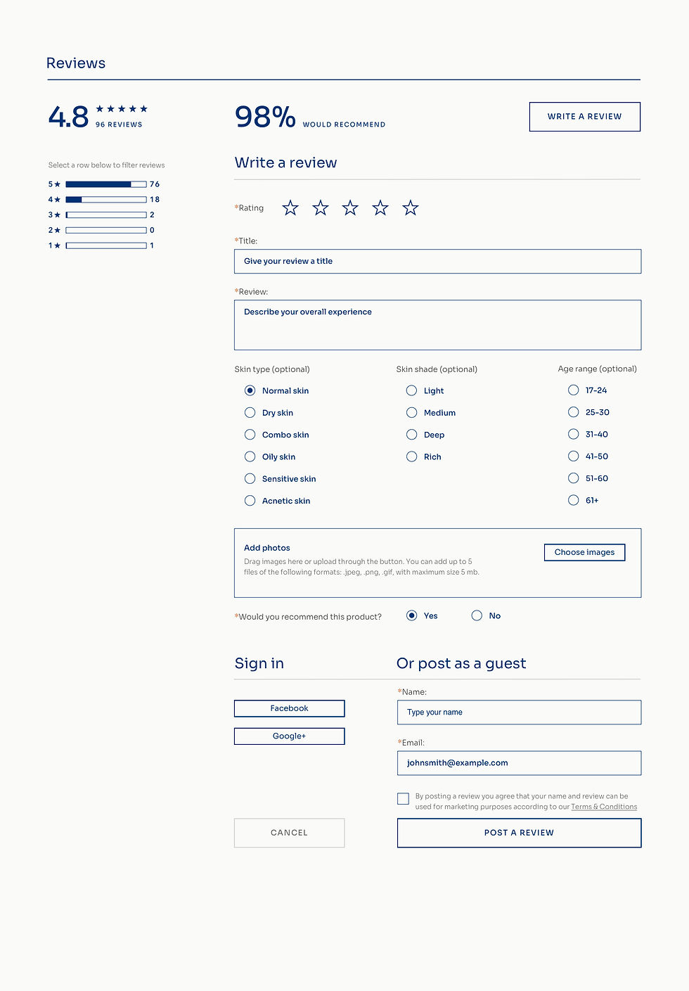
Reviews feed and submission form UI design for Electronics Store
Product research deck
I conducted research and gathered a list of findings that I want to consider or surely want to add to the future design.
-
A detailed rating breakdown where each bar serves as a filter. If there are too few reviews, this breakdown should be hidden.
-
A verified buyer proof — probably a badge. Users want to be sure the reviews are not fake.
-
Ability to upload photos. Quick access to other customers’ photos. Many customers prefer real-life photos to enhanced images from photoshoots provided by business owners.
-
Show mixed reviews (display bad reviews as well). Many users make their buying decision only after studying bad reviews.
-
Electronics stores often ask their customers about the pros and cons of the product.
-
Beauty products’ reviews often contain additional info about the reviewers: age, skin type, etc.
-
Beauty shops frequently show review feed highlights — a clipped version of the review section.


Outcome
Due to thorough research, I found out about the main pain points of users — those who read reviews and tried to escape frequent mistakes in designing reviews sections. Two different industries' approach helped me define the design settings of the widget — what can be changed, added, or removed, and what should be the predetermined minimum.
Credits
Olena Martynova
Product designer
Wireframe & prototype
Based on my research discoveries, I created a wireframe for a submission form and the reviews feed, including a detailed rating breakdown, a ‘verified user’ badge, and a customers’ photos section.

Also, I made a prototype to check the following scenario: a user writes a review, submits it, then edits it — deletes one of the images, then deletes the post altogether.

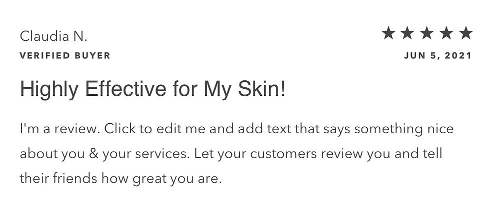
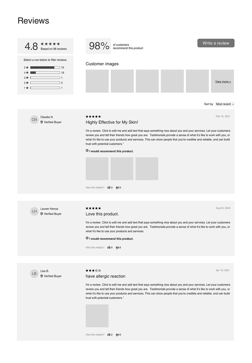
Industry 2 — Online Beauty Shop
For this industry, the brand values were described as: playful, natural, and bold.
Brands guidelines
While creating this visual style, I wanted to combine playfulness and natural, neutral colors.

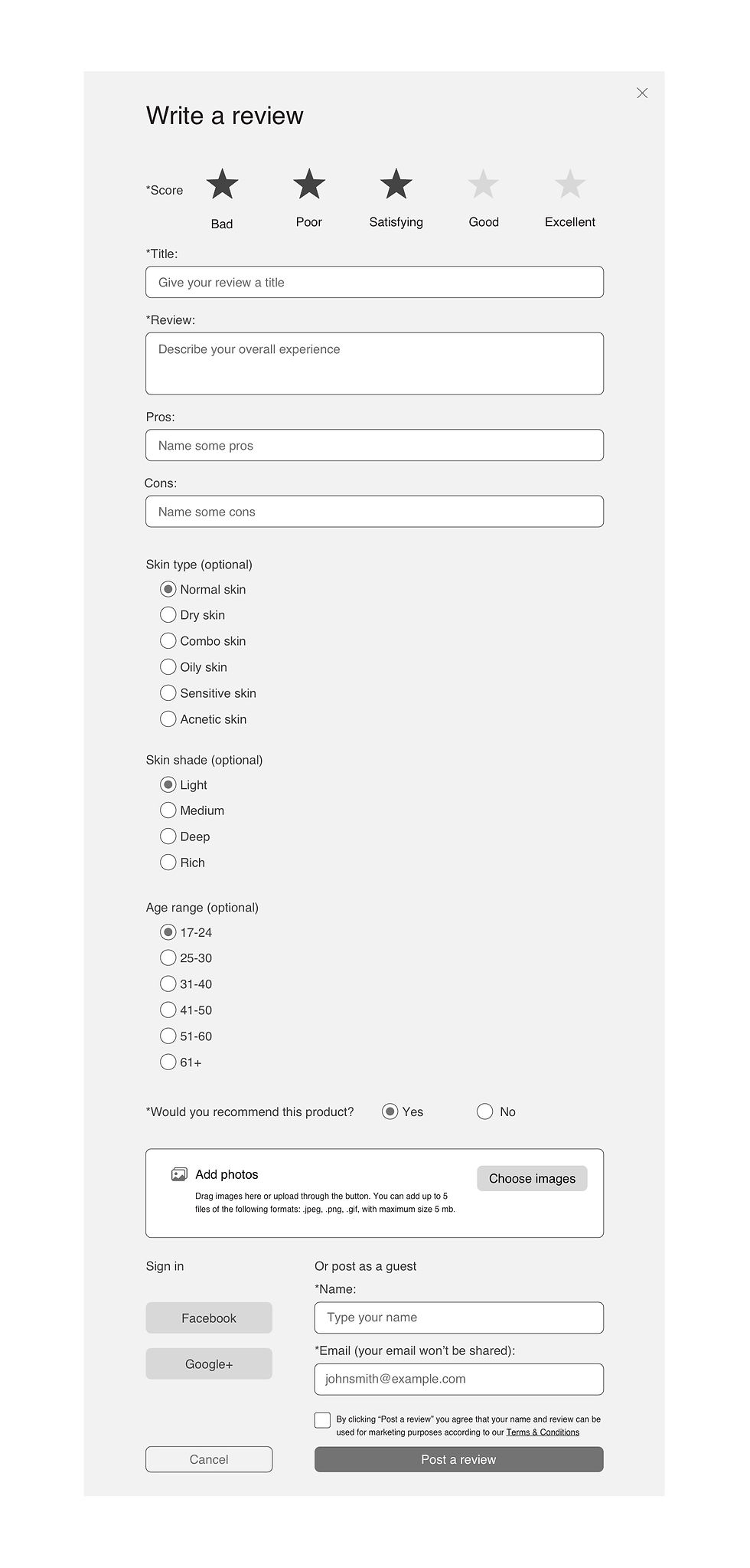
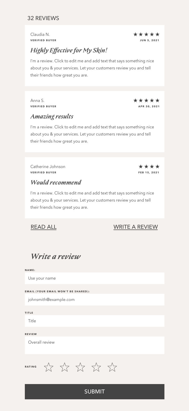
Reviews feed and submission form UI design for Online Beauty Shop


A clipped version of reviews feed and submission form.
I wanted to play a bit and tried out a clipped version of the reviews feed. Here I used a different visual style to have a feeling of how it will look on another user’s site.
This version also helped me to define the design settings of the widget.

Design settings
I defined obligatory elements for one review:
-
Ratings (stars)
-
Name
-
Date
-
Title
-
Review text
Actually, a review in a clipped version of the feed is built from these elements.
Further customization depends on the industry or personal site owner's needs.
What else can be displayed in one review:
-
User’s avatar
-
Pros and cons
-
Images
-
‘I recommend’ badge
-
‘Verified buyer’ badge
-
Was it helpful? (yes/no)
-
Additional info: age, skin type
What we can display on the feed:
-
Rating distribution
-
% of those who would recommend
-
Customer images section
I suggested design settings needed for each element:
-
Images: ratio, corners (rounded, not)
-
Ratings: color, corners
-
Badges: colors, show/not (only text)
-
Avatar: color (if no photo available), contour
-
Text elements: font, size, color
-
Buttons: color, contour, corners, text (font, size, color)
-
Background: color, contour, corners.
Layout options can be: spacious or tight.